
A good landing page design is a necessity if you want your marketing campaigns to be successful.
Without a good landing page design, customers feel lost as to what they need to do. So they just leave, and you lose out on valuable conversions.
The thing about bad landing pages is that the creator might not know what’s wrong with it. Visually, it looks good, has nice flavor for the text, and the design is robust. But it may not be intuitive to navigate, or it might not be apparent at a glance what the desired action is.
Today, we are going to check out how you can create a powerful landing page that actually converts by guiding visitors to do what you need them to.
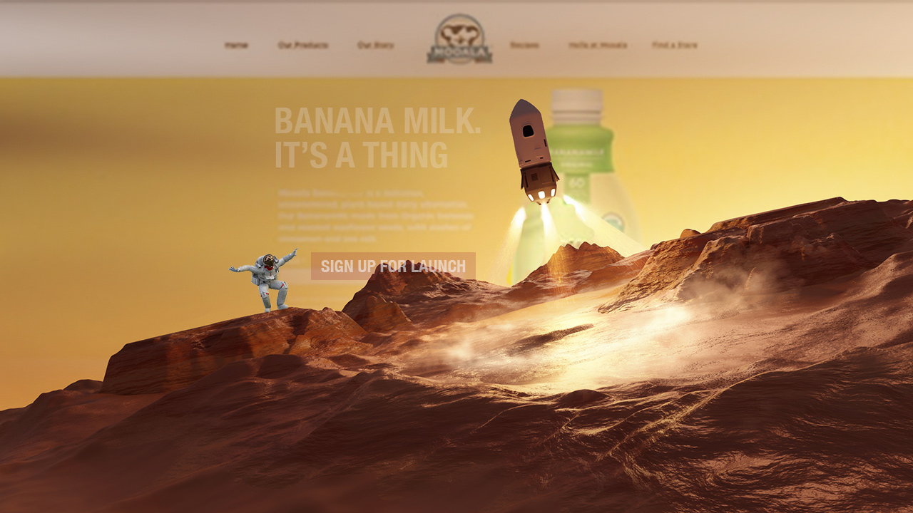
1. Start With One Clear Conversion Goal: “Sign Up For Launch.”
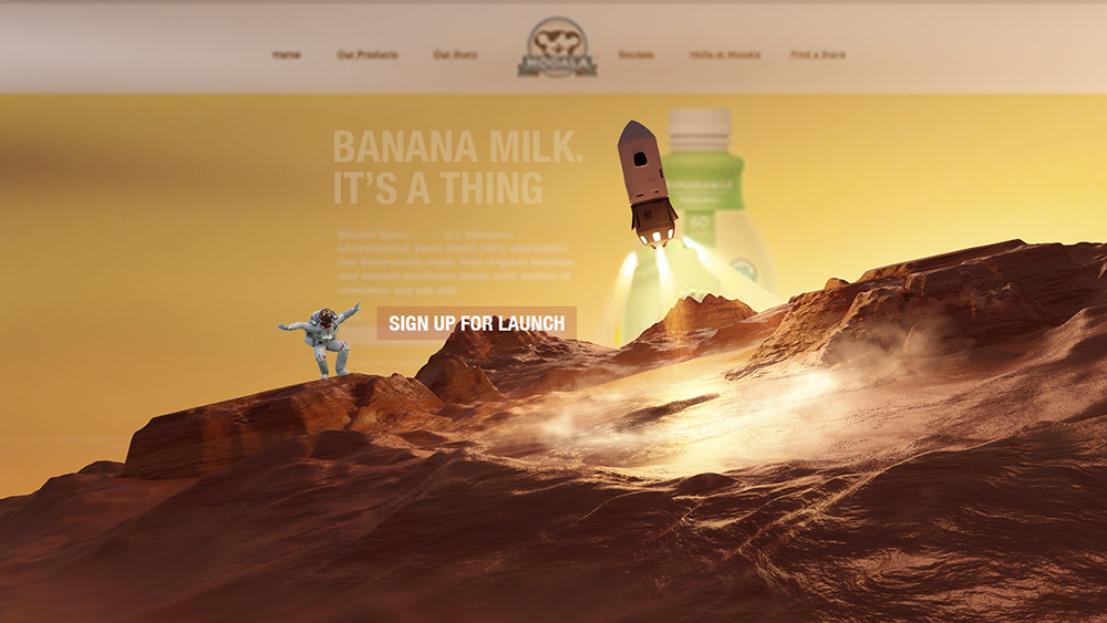
Before you design your landing page, you need to figure out what you want it to do. To figure that out, ask yourself these questions:
- Is it supposed to get people to sign up for something?
- Is it supposed to get people to buy something?
- Are visitors supposed to get some information from the page?
This will help you focus the landing page design to one single objective.
Additionally, you don’t want to provide competing options to the visitors, as that can cause confusion. Just having one primary action is the way to go. What that action is, you already know if you answered the questions above.
Here’s another example of a good landing page that provides only one primary action.

This is the free trial landing page of SEMRUSH. As you can see, the most visually striking text is simply telling the user that they can sign up for a free trial. Then the three buttons that you can see: two of them are for signing up, and only one is for logging in.
So there’s little choice, and the visitor understands that this page is for signing up for a free trial.
2. Make the Value Proposition Obvious
The second thing you need to know is that the landing page design should be clear-cut about what you are offering to the visitor.
So, if you are selling something, then the page should include content that explains why the product matters to the visitor and how it can help them. To do that, you must start with the basics:
- Write a clear headline and subheading
- Write content in those headings that explain to the visitor the benefit of the product and why buying it will help them.
- Make sure that the content is formatted such that the visitor can scan it and immediately understand the value proposition.
Here’s an example of a landing page design that does this:
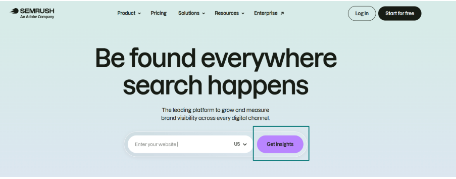
Once again, we took a look at SEMRUSH. This is the main home page for its website. This is where most people will land when looking for SEMRUSH. As you can see, it is immediately apparent what value this platform brings: insights about your website.
3. Design a Strong Above-the-Fold Section
In web design, the fold is the part of the page where you have to scroll to read/see more content. Typically, a new visitor will rarely go below the fold to see what you have to offer, so your landing page must convince them with the content above the fold.
Here’s how you can design your page to have a strong above-the-fold section.
- Put your value proposition near the top.
- Put the supporting information above the fold.
- Keep the design simple and intuitive.
This will help your visitors instantly understand what you are offering. Then they will bother scrolling below the fold to learn the details.
4. Use Calls to Action That Encourage Action
Strong calls to action (CTAs) are your best friends if you want a landing page design that actually encourages conversions. The CTA text should naturally support the type of action you want the visitor to take.
Here’s how you can create a good CTA for your landing page.
- Make CTA buttons visually noticeable.
- Use specific wording instead of generic “Submit” or “Click Here.”
- Place CTAs where they make sense throughout the page.
- Set realistic expectations about what happens after clicking.
You can also use multiple CTAs. For example, instead of just a button, you can put a QR code on there too. You can easily generate QR code for your website with an online tool. You can also create custom designs that don’t look out of place on your landing page.
QR codes are great as CTAs because they add a level of interaction that is hard to replicate.
The main advantage of the QR code is that users can follow it from a different device. I.e., if the landing page was accessed on a desktop, but the user wants to proceed further on mobile, they can interact with the code using a QR code scanner and proceed further with ease.
So, good CTAs are necessary for your landing page to convert.
5. Build Trust Into the Page

How can you tell a new visitor that you are trustworthy? A lack of trust can completely kill the momentum of even the best landing pages. So, you need to convey your trustworthiness to new customers in some way.
The easiest method is to use testimonials. Include a list of your previous clients, especially big-name clients with recognizable names. That is a good way of showing that you are trustworthy.
If you are in the e-commerce business, then include reviews from customers on your landing page that link to real reviews on reputable websites.
6. Keep Forms Short and Easy to Complete
If your landing page is using forms, then you must ensure that they are easy to complete. Here’s how you can do that.
- Ask only for information you actually need.
- Remove unnecessary fields.
- Use clear labels and helpful validation.
- Make the form easy to complete on mobile devices.
- Make it easy to resume completing the form in case of errors or bad page loading
This way your visitors will avoid friction and actually complete the form.
7. Optimize for Speed and Mobile Users

Never forget to optimize your landing page for mobile users. It is no secret that over half of the internet’s traffic is from mobile devices, so websites must cater to them first.
This includes making buttons easy to tap, selecting form fields extremely accessible, and reducing the chances of misclicks.
So make sure your landing page in particular has a responsive design and test it on various tablets and phones to ensure it works flawlessly.
The other thing you must be vigilant about is page loading speed. A landing page that doesn’t load in under a few seconds is useless. Most people will bounce before it loads.
To improve loading times, you have to:
- Compress all images
- Reduce the number of scripts
- And use lazy loading so that everything above the fold loads first.
This will ensure your landing page is seen by your visitors.
Test and Improve the Page
Finally, don’t assume that even after following all of those tips you will get a successful landing page. Depending on your design, CTA quality, CTA placement, and audience type, you will have to try out different designs.
So, this is where you must do A/B testing.
- Test different headlines, CTA wording, images, layouts, and forms.
- Track conversion rate and other meaningful engagement metrics.
- Use the data to identify where visitors are dropping off and improve those areas.
Only with this feedback will you get the ultimate landing page that converts.
So, there you have it: the best ways to design a landing page that actually converts.
The tips boil down to this: everything useful above the fold, value proposition first, make the page easy to navigate, use CTAs, and provide trust signals.
Keep everything short and simple, and ensure that pages load fast and look good. Finally, do A/B testing to see what works and what doesn’t so you know what to invest in.
That’s all there is to it. 🙂

This guest post was written by Roma Diana from Branding Dynasty. She can be reached at roma.diana@brandingdynasty.com. If you want to connect with Sevell + Kropp, contact us today.